How to use the tool
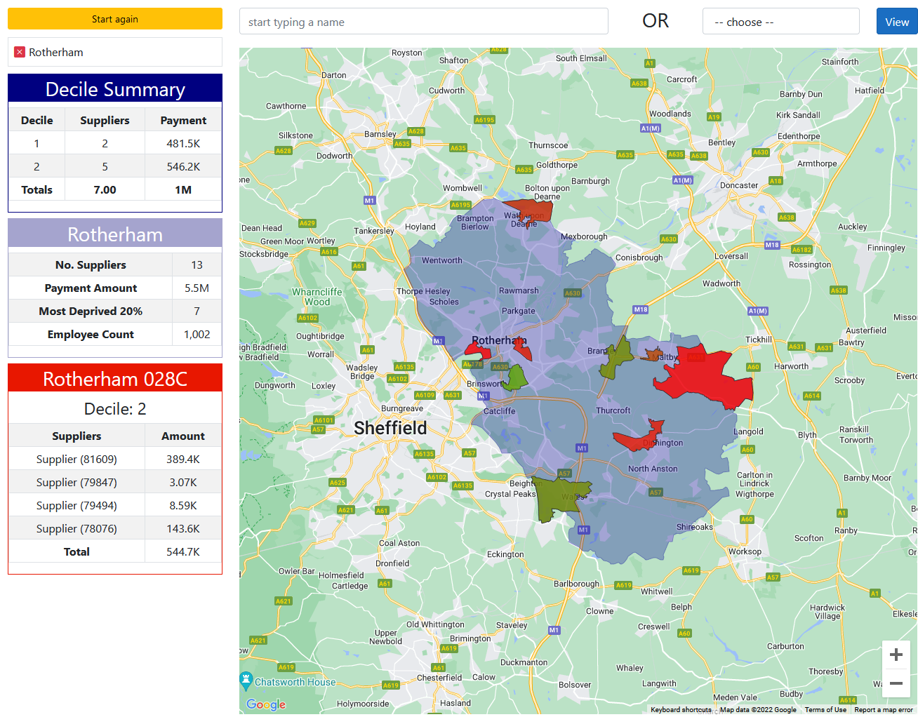
The deprivation tool plots your procurement spending by each supplier against the 30,000 or so different areas of the UK used for the calculation of deprivation indices. These indices are published separately by the four countries of the UK statistical authorities. You can use the tool in two different ways. First just start typing any Local Authority area into the bar at the top. In this case we have chosen Rotherham. You can see that the tables on the left of the screen show summaries for each of the three scales you are looking at.
The decile summary shows how many suppliers you have in each of the two most deprived areas and how much money you paid to them in total. The deprived areas are plotted from green to red with red being the most deprived areas. We only show them on the map if you have a supplier in that area, for simplicity.

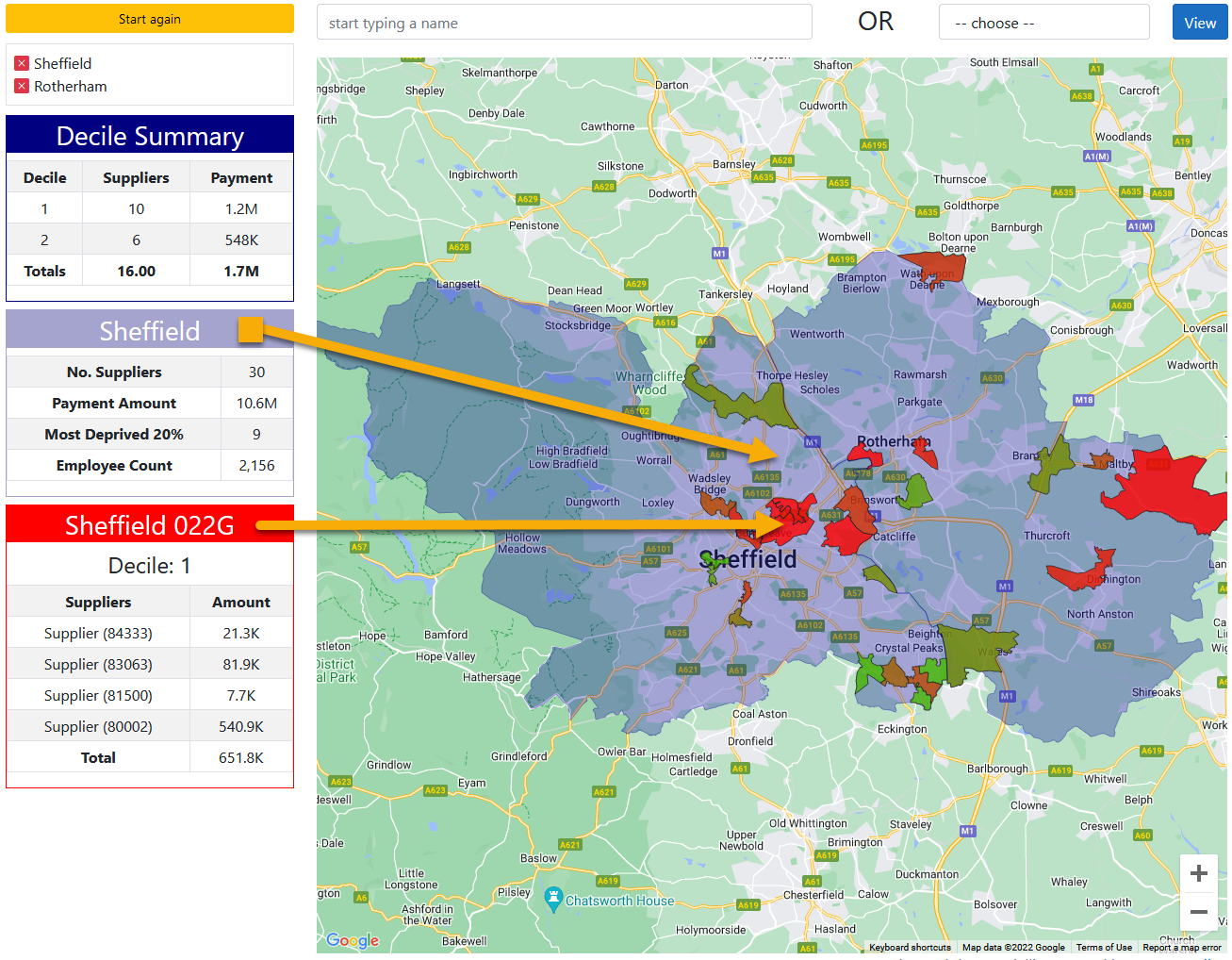
You can also add additional local areas, so now we have added Sheffield into the mix. You can see that the Decile summary has changed.

You can add as many local authorities as you like and they can be anywhere in the UK. At any time you can clear any individual area by clicking on the red X, or start again by using the 'Start again' yellow button.
As you move your cursor around the map the other two boxes will change depending on the cursor position. The purple box shows the local area summary for the area that your cursor is hovering over. In this case we are over Sheffield and the table shows the supplier total, the total amount paid to them, how many are located in the 20% most deprived areas, and (in this case*) how many people they employ.
The bottom (red box) shows the detail for the deprived area where the cursor is by individual supplier and by amount paid to them.
Whole of UK
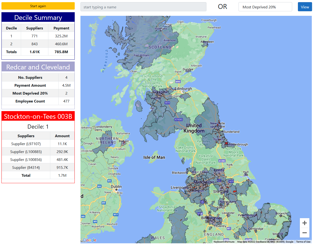
The other method to use is to ask the tool to show a number of pre-set options for the whole of the UK. In this case we are looking at the 20% most deprived areas around the UK. The summary now shows the position for the whole of the UK. The other tables work in the same way changing as the cursor moves around the country. You can also use the zoom function in the map to move to see individual areas closer up.

The data summary screen that you can see shows the total picture of your data that we have uploaded into the system. It also gives an indicative figure for the total wealth (GVA) generated by the organisations activity and a similar indication of how many jobs this activity creates/supports. If you are interested in more details or want to use this tool for your organisation data, please contact us.
*In this case we are able to show employment data as this data is available, we could show other relevant data if required such as jobs created, apprenticeships, direct employee location and contribution.